Iteration 1
Project Goal: To visualize data using the Haply and vibrotactile devices and help answer questions such as “which type of feedback is more suitable for a specific type of visualization?” and “what are some of the ways in which haptics can complement the visualization experience?”
Iteration 1 Approach: Given the circumstances with three out of four of us having different hardware, we took a more experimental based approach: we shared code for developing graphs, tested out various encoding mechanisms using the tactile devices, reported on what we felt, shared our experiences, and then decided on how to go about the next iteration.
The first step was to develop simple, common visualizations
on which we could compare our haptic experiences. A quick search on Google led me
to find a visualization API for Processing developed by an academic team at the
City University London. As you can see, this gives us a wide variety of
visualizations to test out work on:
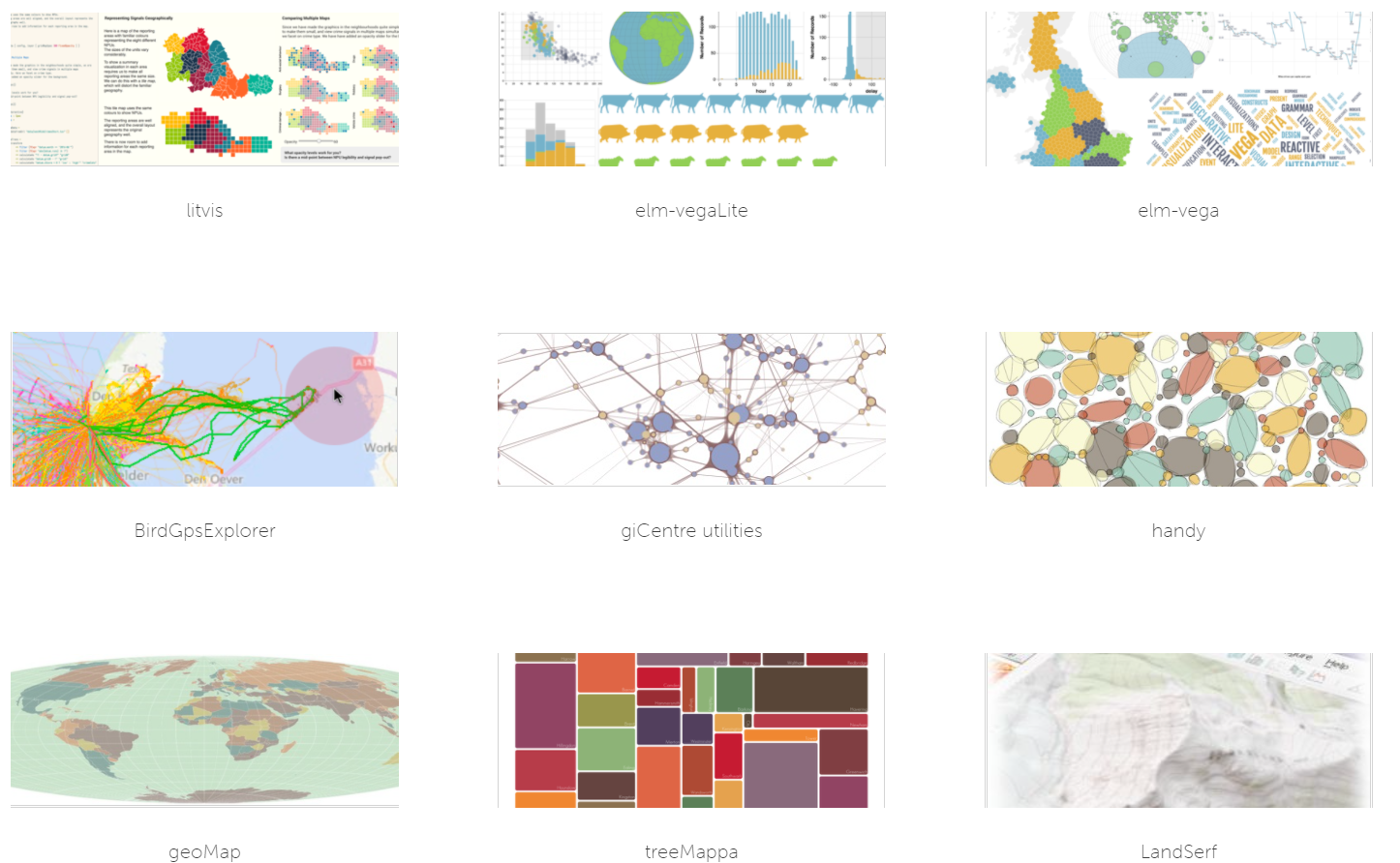
Of course, this is much more than we can use for this project. But it certainly gives us inspiration for ideas to pursue.
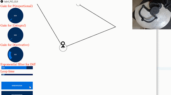
A bar chart was the first step. The initial idea was to tape
a linear resonant actuator (LRA) to the fingertip, hover over the bars with a mouse
connected to the computer, and trigger an “amplitude-based” vibration stimuli
based on the height of the bar. This did not take long and I was pleasantly
surprised at how simple the library was to use – it contained functions to
provide the bin number and corresponding y-axis value from the mouse coordinates
data. Below is an image of my hand over the mouse with the LRA taped to the tip of my index finger with a 3M adhesive.

Since my LRAs are driven by audio, I needed an audio library
to generate a signal that gave me control over parameters such as the
amplitude, frequency, waveform, and signal duration. Preferably one in which I
could also load existing “hapticons” or generate my own patterns. Another reason
for including audio is the need to assist a blind user while they are navigating
the graph. We could narrate the name of the category or bin the mouse was hovering
over before simulating the vibration. I found a pure audio library for varying signal parameters, and a text-to-speech library
for the latter.

A good idea before experimentation is to be familiar with
the literature. How have people tried to vary parameters in order to provide a 'good' haptic experience for visualizations? I summarized a couple of the points from a paper [1] Kathrik, one of our team members, linked:
|
Amplitude |
Frequency |
Waveforms |
Duration |
|
Continuous amplitude not suited for continuous data (harder for humans to differentiate between intensities) |
No more than 9 different levels of frequencies should be used for a graph |
People are good at differentiating
between 2 separate waveforms, but studies are lacking in determining whether
3+ can be discriminated against. |
Stimuli < 100 ms are perceived as a
tap |
|
No more than 4 different intensities
should be used |
Frequency can interfere with amplitude |
A sine wave is considered the smoothest waveform |
Longer stimuli with varying patterns
(hapticons) can deliver a range of perceptions |
Some of these ideas informed us about possible encoding
mechanisms. However, we realized that they do not address more specific questions such
as:
- How should the y-axis value be mapped to the parameter(s) of the stimuli?
- How should one handle negative values of the y-axis?
- How should we deal with noise, fatigue, or other affects associated with multiple or prolonged stimuli?
Therefore, we decided to experiment with a trial and
error approach to see how best we could distinguish between two bars. For the
sake of simplicity, we tuned only one parameter at a time. The frequency and
amplitude were tuned by multiplying the y-axis value by a constant such that
the magnitude of the parameters would fall in the human perceivable range.
Some of the mechanisms I tested were:
- Continuous pulse, amplitude variation;
- Continuous pulse, frequency variation;
- N discrete pulses, where N represents the y-axis value, constant amplitude and frequency;
- Discrete pulses with the vibration duration based on the y-axis value, constant amplitude and frequency;
- A combination of continuous and discrete pulses, constant amplitude and frequency;
In each trial, the bar values were randomized, and I looked away from the screen to see how well I could interpret the data only 'haptically'. The y-axis values were integers that ranged from 1 - 10. A video in which one of these encodings (#2) is demonstrated is linked below. In both #1 and #2, it was easy to interpret the trend of the data, but I believe that with training, even exact values would not be difficult to determine. Interestingly, it seemed easier to distinguish between drops rather than rises in amplitude from one bar to another. This was not the case with frequency, where drops and rises felt “equally distinguishable”. #3 allows the user to obtain exact values consistently, at the expense of taking more time and #4 was felt as a 'compromise' in which the users could map the duration to the y-axis value. In #5, a long pulse and a short pulse were stimulated to represent an increase in the y-axis by 5 units and 1 unit respectively. For example, 3 pulses would be treated as 3 short taps, while 9 would be represents as 1 long pulse, and 2 short taps. I was unable to notice a difference in perceived accuracy by switching the waveform (from e.g., sine to sawtooth).
One of the fundamental issues with this approach was comparing two bins that were not “neighbors”. As evident from the video, the user must pass through neighboring bins before reaching the “target” one. Additionally, the user has to create a mental mapping of the trend of the bars, which may cause cognitive overload and prove to be problematic for charts in which there are several bins. Lastly, the JND and maximum range for parameters implies that patterns would be required to represent a larger range of y-axis values. These limitations lead me to my next point…
Were we able to achieve the objectives set out for this iteration in our proposal? Yes. Did I feel this was enough? It was a good starting point, but I feel our focus was more on trying to represent the visual data as best as we could haptically, and not on the underlying end goal of how to effectively use the haptic modality itself! Perhaps the above work or some variation thereof may only prove to be useful for the deaf-blind, but almost certainly not useful elsewhere. As a team, we quickly realized that vibrotactile feedback generally cannot replace the effectiveness of audio or visual cues in interpreting visualization data. It has a much lower bandwidth and patterns are more difficult to distinguish from one another.
Instead, our focus should be towards complementing the interaction experience
with the data such that a significant portion of the interaction experience is
lost when the haptics are “switched off”; thus, with haptics, users would be provided with a richer
experience while they explore. For example, five dimensional data may be
difficult to interpret using visual cues due to visual overload. What if one of
these dimensions was expressed haptically? Would replacing this dimension with
haptics be more effective than representing the same dimension aurally? We
might be able to think of careful ways in which we can objectively test the
effectiveness of (each type of) haptic feedback in this scenario. Another
example is if haptics could reduce the time taken in navigating to a particular
point in a large scatter plot, a common visualization task. We could compare
the time taken with and without haptic experience over a series of trials. Also,
why restrict ourselves to simple charts? Maps, scientific diagrams and signs
may be worth looking into as well. We may explore these ideas or related ideas –
and not ones in which we extend the same work to other charts - as part of the
next steps. That is not to say we are committing to any of these ideas; the Haplys
seems to be on their way, and toying around with them may inform us of other
possible avenues.
On a side note, after experimenting with the bar chart, I
found some time to play around with another interactive program from the visualization
library. Here, I added the functionality of a continuous vibration with an amplitude
corresponding to the y-axis of the moving red dot. The user would also feel a 'bump' when the dot reversed direction in the y-axis. As stated earlier, there are many examples in the library that might provide us with further inspiration.

References:
[1]

Comments
Post a Comment